Weyerbacher, in their continuing effort to keep the train rolling on their rebranding effort, submitted two new labels for approval recently. Comparing them to the other logos released so far, these are our favorites.
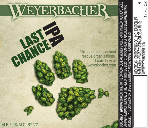
The first is for their Last Chance IPA, which we recently detailed here. The IPA will debut soon and replace their Hops Infusion IPA. The label features hops arranged in the shape of a paw, a nod to the company donating proceeds from the beer to animal rescue organizations.
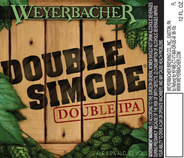
The second up is their awesome double IPA, Double Simcoe. It’s a pretty simple logo with a wooden crate branded with the beer name in the middle with hops adorning the border. Simple and nice.


